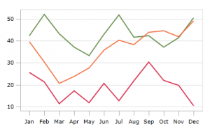
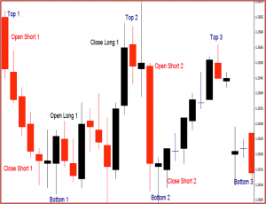
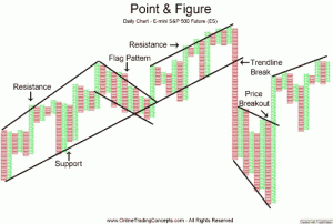
There are four main types of charts that are used by investors and traders depending on the information that they are seeking and their individual skill levels. The chart types are: the line chart, the bar chart, the candlestick chart and the point and figure chart. In the following sections, we will focus on the S&P 500 Index during the period of January 2006 through May 2006. Notice how the data used to create the charts is the same, but the way the data is plotted and shown in the charts is different.
Line Chart
The most basic of the four charts is the line chart because it represents only the closing prices over a set period of time. The line is formed by connecting the closing prices over the time frame. Line charts do not provide visual information of the trading range for the individual points such as the high, low and opening prices. However, the closing price is often considered to be the most important price in stock data compared to the high and low for the day and this is why it is the only value used in line charts.
Bar Charts
The bar chart expands on the line chart by adding several more key pieces of information to each data point. The chart is made up of a series of vertical lines that represent each data point. This vertical line represents the high and low for the trading period, along with the closing price. The close and open are represented on the vertical line by a horizontal dash. The opening price on a bar chart is illustrated by the dash that is located on the left side of the vertical bar. Conversely, the close is represented by the dash on the right. Generally, if the left dash (open) is lower than the right dash (close) then the bar will be shaded black, representing an up period for the stock, which means it has gained value. A bar that is colored red signals that the stock has gone down in value over that period. When this is the case, the dash on the right (close) is lower than the dash on the left (open).
Candlestick Charts
The candlestick chart is similar to a bar chart, but it differs in the way that it is visually constructed. Similar to the bar chart, the candlestick also has a thin vertical line showing the period’s trading range. The difference comes in the formation of a wide bar on the vertical line, which illustrates the difference between the open and close. And, like bar charts, candlesticks also rely heavily on the use of colours to explain what has happened during the trading period. A major problem with the candlestick colour configuration, however, is that different sites use different standards; therefore, it is important to understand the candlestick configuration used at the chart site you are working with. There are two colour constructs for days up and one for days that the price falls. When the price of the stock is up and closes above the opening trade, the candlestick will usually be white or clear. If the stock has traded down for the period, then the candlestick will usually be red or black, depending on the site. If the stock’s price has closed above the previous day’s close but below the day’s open, the candlestick will be black or filled with the colour that is used to indicate an up day.
Point and Figure Charts
The point and figure chart is not well known or used by the average investor but it has had a long history of use dating back to the first technical traders. This type of chart reflects price movements and is not as concerned about time and volume in the formulation of the points. The point and figure chart removes the noise, or insignificant price movements, in the stock, which can distort traders’ views of the price trends. These types of charts also try to neutralize the skewing effect that time has on chart analysis.
When first looking at a point and figure chart, you will notice a series of Xs and Os. The Xs represent upward price trends and the Os represent downward price trends. There are also numbers and letters in the chart; these represent months, and give investors an idea of the date. Each box on the chart represents the price scale, which adjusts depending on the price of the stock: the higher the stock’s price the more each box represents. On most charts where the price is between $20 and $100, a box represents $1, or 1 point for the stock. The other critical point of a point and figure chart is the reversal criteria. This is usually set at three but it can also be set according to the chartist’s discretion. The reversal criteria set how much the price has to move away from the high or low in the price trend to create a new trend or, in other words, how much the price has to move in order for a column of Xs to become a column of Os, or vice versa. When the price trend has moved from one trend to another, it shifts to the right, signalling a trend change.
Conclusion
Charts are one of the most fundamental aspects of technical analysis. It is important that you clearly understand what is being shown on a chart and the information that it provides. Now that we have an idea of how charts are constructed, we can move on to the different types of chart patterns.


